臺南燈會 LOGO 設計
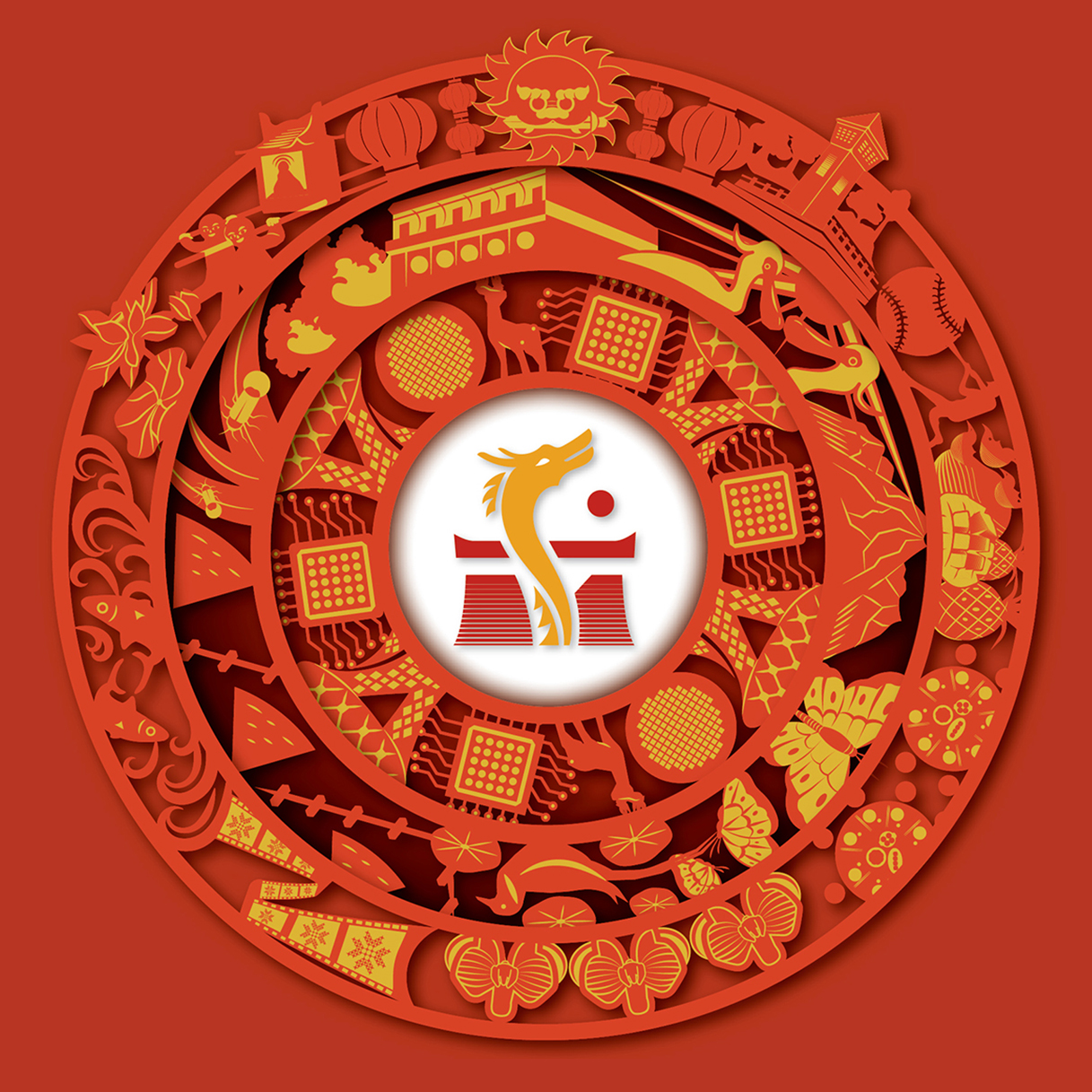
LOGO以南字為主題,結合飛檐與城牆,以及代表吉祥祝福的祥龍守護著臺南。圓圈起臺南萬象非凡的因緣,其中由四個大圓所組成的形象,比喻走過四個百年的南方古都,而四個大圓中,總共融入了26個臺南特色圖案。
The logo is designed with the character "南" which means "south." It combines features like flying eaves and city walls, and a lucky dragon that represents good wishes and protects the city of Tainan. The logo features a circular design that symbolizes the unique connections and diverse aspects of Tainan. The logo has four big circles inside it, representing Tainan's 400 years of history. Within these four circles, there are 26 unique designs that represent Tainan.
第一圓容納豐富多元的文化與特產;第二圓包裹自然生態特質;第三圓展現高科技未來的尖端基石,圖案有沙崙智慧綠能科學城太陽能樹、晶圓、電路板等;第四圓則是2024台灣燈會在臺南之主視覺LOGO,從南發光,龍耀全臺。
- The first circle shows Tainan's rich culture and specialty products.
- The second circle has nature and environment themes.
- The third circle shows advanced technology, with symbols like the solar trees of Shalun Smart Green Energy Science City, semiconductor wafers, and circuit boards.
- The fourth circle is the main logo for the Taiwan Lantern Festival in 2024, showing Tainan's spirit.
海報的配色,呼應臺南市徽的色彩調性,傳達象徵溫暖、熱情、樸實、人文等臺南特色,並以廟堂紅及日曬金兩大色系漸變深化,細膩和諧地呈現臺南多彩多姿之貌,期待能傳達國家慶典之共榮昌盛的恢弘寓意。
The poster's color scheme match those of the Tainan city emblem. The colors red and gold are used in gradients to showcase Tainan's warmth, passion, modesty, and cultural richness. The design aims to convey the prosperity and celebratory spirit of a national celebration.

Comments
Post a Comment